ElevatedButton is a Material Design’s elevated button which can be used to add dimension to otherwise mostly flat layouts. It is advised to avoid using this widget on already-elevated content such as dialogs or cards.
ElevatedButton replaces RaisedButton widget.
Table of Contents
Basic ElevatedButton
ElevatedButton requires 2 properties at minimum, onPressed and child.
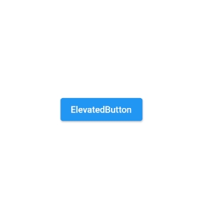
ElevatedButton(
onPressed: () {},
child: Text('ElevatedButton')
)
Change background color
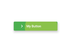
Color style such as background and overlay ones can be adjust by using ButtonStyle.
ElevatedButton(
          onPressed: () {
            print('Clicked Me!');
          },
              style: ButtonStyle(
                backgroundColor: MaterialStateProperty.all<Color>(Colors.green),
                overlayColor: MaterialStateProperty.all<Color>(Colors.lightGreen),
              ),
          child: Container(
            width: 160,
            height: 40,
            padding: EdgeInsets.all(8.0),
            child: Row(
              children: [
                Icon(Icons.navigate_next),
                SizedBox(width: 8,),
                Text('My Button')
              ],
            ),
          ),
        )
ElevatedButton(
          onPressed: () {
            print('My button using ElevatedButton.styleFrom()');
          },
          style: ElevatedButton.styleFrom(
		    primary: Colors.green, // background
		    onPrimary: Colors.lightGreen, // foreground
		  ),
          child: Container(
            width: 160,
            height: 40,
            padding: EdgeInsets.all(8.0),
            child: Row(
              children: [
                Icon(Icons.navigate_next),
                SizedBox(width: 8,),
                Text('My Button')
              ],
            ),
          ),
        )