A floating action button (FAB) is a circular icon button that floats over content to promote a primary action in a Flutter application. It is often used to add quick access to actions such as Add New, Refresh, Next Step, etc…
Following are the best floating action button libraries to enhance its features:
Table of Contents
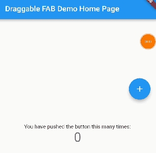
draggable_fab
draggable_fab is a draggable FAB wrapper widget which can be dragged to any edge of the screen, which makes it easier for users to access depends on their conditions.
DraggableFab(
	child: FloatingActionButton(
	onPressed: (){
		print('clicked')
	},
	child: Icon(Icons.add),
	),
);
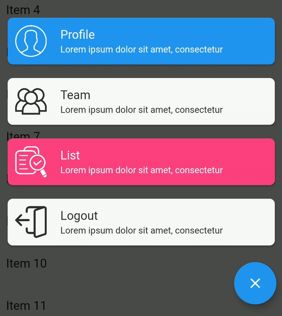
flutter_boom_menu
The BoomMenu widget implements a Boom Menu, with icons, title, sub title, animated FAB Icon and hide on scrolling. It is built to be placed in the Scaffold.floatingActionButton argument, replacing the FloatingActionButton widget.
BoomMenu(
	animatedIcon: AnimatedIcons.menu_close,
	animatedIconTheme: IconThemeData(size: 24.0),
	onOpen: () => print('OPENING DIAL'),
	onClose: () => print('DIAL CLOSED'),
	scrollVisible: scrollVisible,
	overlayColor: Colors.black,
	overlayOpacity: 0.7,
	children: [
		MenuItem(
		  child: Icon(Icons.accessibility, color: Colors.black),
		  title: "Profiles",
		  titleColor: Colors.white,
		  subtitle: "You Can View the Noel Profile",
		  subTitleColor: Colors.white,
		  backgroundColor: Colors.deepOrange,
		  onTap: () => print('FIRST CHILD'),
		),
		MenuItem(
		  child: Icon(Icons.brush, color: Colors.black),
		  title: "Profiles",
		  titleColor: Colors.white,
		  subtitle: "You Can View the Noel Profile",
		  subTitleColor: Colors.white,
		  backgroundColor: Colors.green,
		  onTap: () => print('SECOND CHILD'),
		),
		MenuItem(
		  child: Icon(Icons.keyboard_voice, color: Colors.black),
		  title: "Profile",
		  titleColor: Colors.white,
		  subtitle: "You Can View the Noel Profile",
		  subTitleColor: Colors.white,
		  backgroundColor: Colors.blue,
		  onTap: () => print('THIRD CHILD'),
		),
		MenuItem(
		  child: Icon(Icons.ac_unit, color: Colors.black),
		  title: "Profiles",
		  titleColor: Colors.white,
		  subtitle: "You Can View the Noel Profile",
		  subTitleColor: Colors.white,
		  backgroundColor: Colors.blue,
		  onTap: () => print('FOURTH CHILD'),
		)
	],
)
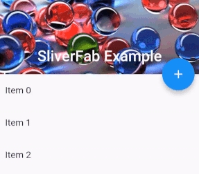
sliver_fab
sliver_fab widget places a widget on the edge of FlexibleSpacebar.
Scaffold(
  body: Builder(
    builder: (context) =>
    SliverFab(
      floatingWidget: FloatingActionButton(
        onPressed: () =>
            Scaffold.of(context).showSnackBar(
                SnackBar(content: Text("You clicked FAB!"))),
        child: Icon(Icons.add),
      ),
      floatingPosition: FloatingPosition(right: 16),
      expandedHeight: 256.0,
      slivers: <Widget>[
        SliverAppBar(
          expandedHeight: 256.0,
          pinned: true,
          flexibleSpace: FlexibleSpaceBar(
            title: Text("SliverFab Example"),
            background: Image.asset(
              "img.jpg",
              fit: BoxFit.cover,
            ),
          ),
        ),
        SliverList(
          delegate: SliverChildListDelegate(
            List.generate(
              30,
                  (int index) =>
              ListTile(title: Text("Item $index")),
            ),
          ),
        ),
      ],
    ),
  ),
);
flutter_fab_dialer
This widget use a Fab Dialer / Fab Speed Dial to use it as a menu. It supports four types of fab menu items.

FabMiniMenuItem.withTextWithImage(
	img,
	4.0,
	"Button menu",
	(){
		//do something here
	},
	"Tap me",
	Colors.blue,
	Colors.white,
	true
),
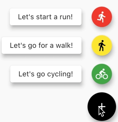
simple_speed_dial
This is also a simple speed dial for Flutter. You can add infinity number of menu items with or without label next to an icon. Colors of every FAB and cusotm animation controller can be set.
SpeedDial(
    child: Icon(Icons.add),
    closedForegroundColor: Colors.black,
    openForegroundColor: Colors.white,
    closedBackgroundColor: Colors.white,
    openBackgroundColor: Colors.black,
    speedDialChildren: <SpeedDialChild>[
      SpeedDialChild(
        child: Icon(Icons.directions_run),
        foregroundColor: Colors.white,
        backgroundColor: Colors.red,
        label: 'Let\'s start a run!',
        onPressed: () {
        },
        closeSpeedDialOnPressed: false,
      ),
      SpeedDialChild(
        child: Icon(Icons.directions_walk),
        foregroundColor: Colors.black,
        backgroundColor: Colors.yellow,
        label: 'Let\'s go for a walk!',
        onPressed: () {
        },
      ),

    ],
)