BottomAppBar is a container that is typically used with Scaffold‘s bottomNavigationBar, and can have a notch along the top that makes room for an overlapping FloatingActionButton. We need more than that, with beautiful icons and animations.
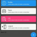
A Bottom Sheet shows information that supplements the primary content of the app.
Table of Contents
Bottom Navigation Bar
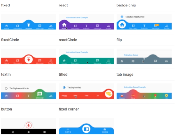
convex_bottom_bar
This widget will bring life to your app. It support a large variety of designs and animations.
import 'package:convex_bottom_bar/convex_bottom_bar.dart';

Scaffold(
  bottomNavigationBar: ConvexAppBar(
    items: [
      TabItem(icon: Icons.home, title: 'Home'),
      TabItem(icon: Icons.map, title: 'Explore'),
      TabItem(icon: Icons.add, title: 'New'),
      TabItem(icon: Icons.message, title: 'History'),
      TabItem(icon: Icons.people, title: 'Account'),
    ],
    initialActiveIndex: 2,//optional, default as 0
    onTap: (int i) => print('click index=$i'),
  )
);
animated_bottom_navigation_bar
This bottom navigation bar library offers a widget which make icon glowing on tap.
Scaffold(
   body: Text('Homepage'), //destination screen
   floatingActionButtonLocation: FloatingActionButtonLocation.centerDocked,
   bottomNavigationBar: AnimatedBottomNavigationBar(
      icons: iconList,
      activeIndex: _bottomNavIndex,
      gapLocation: GapLocation.center,
      notchSmoothness: NotchSmoothness.verySmoothEdge,
      leftCornerRadius: 32,
      rightCornerRadius: 32,
      onTap: (index) => setState(() => _bottomNavIndex = index),
      //other params
   ),
);
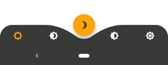
curved_navigation_bar
curved_navigation_bar is a stunning animating curved shape navigation bar. It supports adjustable color, background color, animation curve, and animation duration.
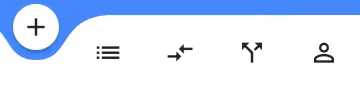
CurvedNavigationBar(
  backgroundColor: Colors.blueAccent,
  items: <Widget>[
    Icon(Icons.add, size: 30),
    Icon(Icons.list, size: 30),
    Icon(Icons.compare_arrows, size: 30),
  ],
  onTap: (index) {
    //Handle button tap
  },
)
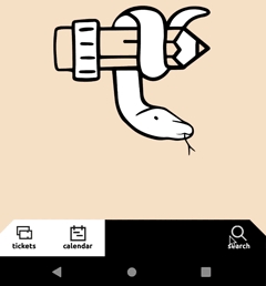
flutter_snake_navigationbar
This widget adds snake animation on menu item changing.
Scaffold(
      bottomNavigationBar: SnakeNavigationBar.color(
        behaviour: snakeBarStyle,
        snakeShape: snakeShape,
        shape: bottomBarShape,
        padding: padding,
        snakeViewColor: selectedColor,
        selectedItemColor: snakeShape == SnakeShape.indicator ? selectedColor : null,
        unselectedItemColor: Colors.blueGrey,
        showUnselectedLabels: showUnselectedLabels,
        showSelectedLabels: showSelectedLabels,
        currentIndex: _selectedItemPosition,
        onTap: (index) => setState(() => _selectedItemPosition = index),
        items: [
          BottomNavigationBarItem(icon: Icon(Icons.notifications), label: 'tickets'),
          BottomNavigationBarItem(icon: Icon(CustomIcons.calendar), label: 'calendar'),
          BottomNavigationBarItem(icon: Icon(CustomIcons.home), label: 'home'),
          BottomNavigationBarItem(icon: Icon(CustomIcons.podcasts), label: 'microphone'),
          BottomNavigationBarItem(icon: Icon(CustomIcons.search), label: 'search')
        ],
      ),
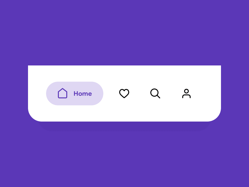
salomon_bottom_bar
If you like a simple UI for bototm bar, salomon_botom_bar is good enoguh. Label and icon are supported with expanding animation when being active.
SalomonBottomBar(
  currentIndex: _SelectedTab.values.indexOf(_selectedTab),
  onTap: _handleIndexChanged,
  items: [
    /// Home
    SalomonBottomBarItem(
      icon: Icon(Icons.home),
      title: Text("Home"),
      selectedColor: Colors.purple,
    ),

    /// Likes
    SalomonBottomBarItem(
      icon: Icon(Icons.favorite_border),
      title: Text("Likes"),
      selectedColor: Colors.pink,
    ),

    /// Search
    SalomonBottomBarItem(
      icon: Icon(Icons.search),
      title: Text("Search"),
      selectedColor: Colors.orange,
    ),

    /// Profile
    SalomonBottomBarItem(
      icon: Icon(Icons.person),
      title: Text("Profile"),
      selectedColor: Colors.teal,
    ),
  ],
)
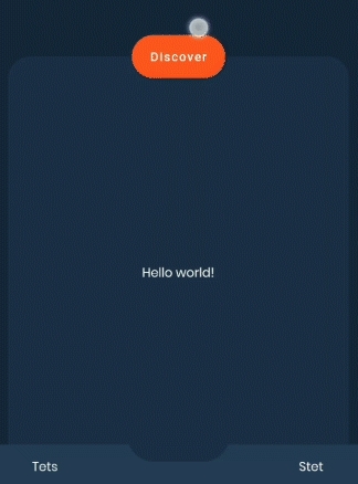
expandable_bottom_bar
This is an animatable bottom app bar with expandable sheet.
bottomNavigationBar: BottomExpandableAppBar(
        // Provide the bar controller in build method or default controller as ancestor in a tree
        controller: bbc,
        expandedHeight: expandedHeight.value,
        horizontalMargin: 16,
        expandedBackColor: Theme.of(context).backgroundColor,
        // Your bottom sheet code here
        expandedBody: Center(
          child: Text("Hello world!"),
        ),
        // Your bottom app bar code here
        bottomAppBarBody: Padding(
          padding: const EdgeInsets.all(8.0),
          child: Row(
            mainAxisSize: MainAxisSize.max,
            children: <Widget>[
              Expanded(
                child: Text(
                  "Hello",
                  textAlign: TextAlign.center,
                ),
              ),
              Spacer(
                flex: 2,
              ),
              Expanded(
                child: Text(
                  "World",
                  textAlign: TextAlign.center,
                ),
              ),
            ],
          ),
        ),
      )
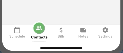
ff_navigation_bar
This is a configurable bottom navigation bar with raised highlight and shadow.
FFNavigationBar(
  theme: FFNavigationBarTheme(
    barBackgroundColor: Colors.white,
    selectedItemBorderColor: Colors.yellow,
    selectedItemBackgroundColor: Colors.green,
    selectedItemIconColor: Colors.white,
    selectedItemLabelColor: Colors.black,
  ),
  selectedIndex: selectedIndex,
  onSelectTab: (index) {
    setState(() {
      selectedIndex = index;
    });
  },
  items: [
    FFNavigationBarItem(
      iconData: Icons.calendar_today,
      label: 'Schedule',
    ),
    FFNavigationBarItem(
      iconData: Icons.people,
      label: 'Contacts',
    ),
    FFNavigationBarItem(
      iconData: Icons.attach_money,
      label: 'Bills',
    ),
    FFNavigationBarItem(
      iconData: Icons.note,
      label: 'Notes',
    ),
    FFNavigationBarItem(
      iconData: Icons.settings,
      label: 'Settings',
    ),
  ],
),
Bottom Sheet
rubber
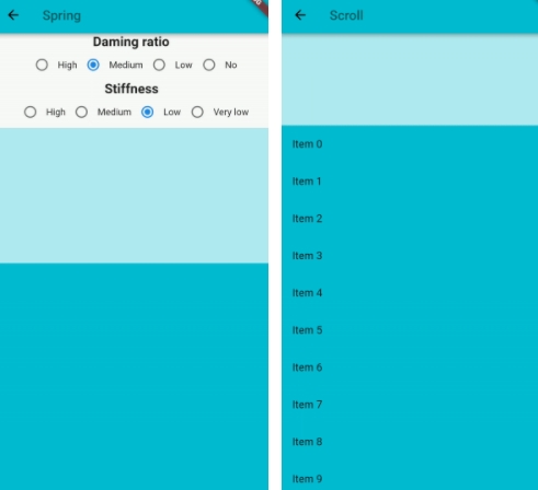
Rubber is an elastic bottom sheet widget with the customizable material spring animation.
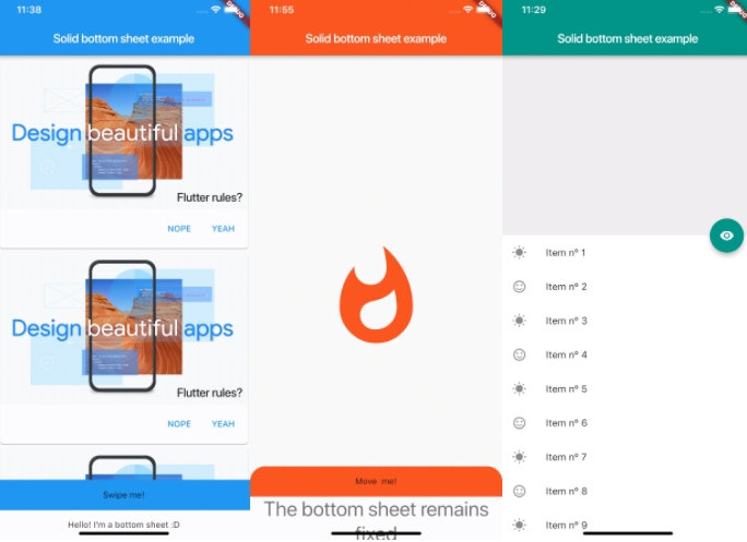
solid_bottom_sheet
The widget is a full customizable bottom sheet and it is easy to implement.
SolidBottomSheet(
  headerBar: Container(
    color: Theme.of(context).primaryColor,
    height: 50,
    child: Center(
      child: Text("Swipe me!"),
    ),
  ),
  body: Container(
    color: Colors.white,
    height: 30,
    child: Center(
      child: Text(
        "Hello! I'm a bottom sheet :D",
        style: Theme.of(context).textTheme.display1,
    ),
  ),
),