There are many types of buttons as widgets in Flutter.
- ButtonBar – A horizontal arrangement of buttons.
- DropdownButton – Shows the currently selected item and an arrow that opens a menu for selecting another item.
- FlatButton (Deprecated, replaced by TextButton) – A flat button is a section printed on a Material Components widget that reacts to touches by filling with color.
- RaisedButton (Deprecated, replaced by EvalatedButton) – A raised button is based on a Material widget whose Material.elevation increases when the button is pressed.
- FloatingActionButton – A floating action button is a circular icon button that hovers over content to promote a primary action in the application.
- IconButton – An icon button is a picture printed on a Material widget that reacts to touches by filling with color.
- OutlineButton (Deprecated, replaced by OutlinedButton) – A medium-emphasis button for secondary actions that are important but are not the primary action in an app.
- PopupMenuButton – Displays a menu when pressed and calls onSelected when the menu is dismissed because an item was selected.
Table of Contents
Change button color for whole app
This can be changed via MaterialApp’s theme.
return MaterialApp(
  title: 'My App',
  theme: ThemeData(
    buttonTheme: ButtonThemeData(
      buttonColor: ThemeColor().primaryColor,
      textTheme: ButtonTextTheme.primary,
    ),
  ),
  home: MyHomePage(title: 'App Home Page'),
);
onPressed event
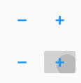
RaisedButton(
  onPressed: () {
    print('Pressed');
  },
  child: FaIcon(FontAwesomeIcons.minus,
      size: 16, color: Colors.blue),
)
FlatButton(
onPressed: () {
print('Pressed');
},
child: FaIcon(FontAwesomeIcons.minus,
size: 16, color: Colors.blue),
)Round button with text and icon

child: SizedBox.fromSize(
    size: Size(64, 64), // button width and height
    child: ClipOval(
      child: Material(
        color: Colors.white,
        child: InkWell(
          splashColor: Colors.blueGrey,
          onTap: () {},
          child: Column(
            mainAxisAlignment: MainAxisAlignment.center,
            children: <Widget>[
              Icon(Icons.perm_identity),
              Text("Profile"),
            ],
          ),
        ),
      ),
    ),
  ),
Make button’s background color transparent
RaisedButton have a grey background if there is no overlay color. So it is better to use FlatButton in this case.
FlatButton(
  onPressed: () {
    print('Pressed');
  },
  child: FaIcon(FontAwesomeIcons.minus,
      size: 16, color: Colors.blue,),
),