Toast is an import UI element in an Android app. It is used to notify users about result of an operation. These Flutter Toast packages adds this element to Flutter app as a widget.
Table of Contents
fluttertoast
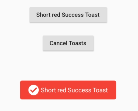
fluttertoast is flexible in implementation as it supports two kinds of toast messages one which requires BuildContext other with No BuildContext.
luttertoast.showToast(
        msg: "There is something wrong with the network.",
        toastLength: Toast.LENGTH_SHORT,
        gravity: ToastGravity.CENTER,
        timeInSecForIosWeb: 1,
        backgroundColor: Colors.red,
        textColor: Colors.white,
        fontSize: 24.0
    );
bot_toast
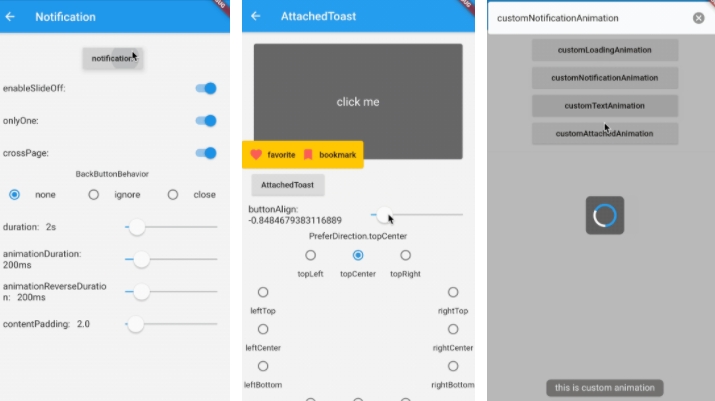
bot_toast is a feature-rich Toast, it supports displaying notifications, text, loading, attachments, etc.
BotToast.showSimpleNotification(title: "Loading...");  //show notification
BotToast.showText(text:"Welcome!");  //show text
BotToast.showLoading(); //show a loading indicator
It also supports custom animation with BotToast.showAnimationWidget().
flutter_easyloading
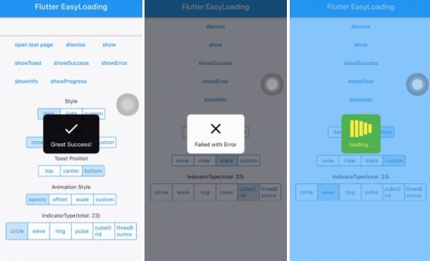
This is a clean and lightweight toast widget for Flutter, which can be used to show loading indicator. It can be used without BuildContext. The library works on iOS, Android and Web.
EasyLoading.show(status: 'Loading...');
EasyLoading.showProgress(0.3, status: 'Downloading...');
EasyLoading.showSuccess('Downloaded successfully!');
EasyLoading.showError('There is something wrong. Check again later!');
EasyLoading.showInfo('Your input was saved.');
EasyLoading.showToast('My toast');
EasyLoading.dismiss();
flutter_styled_toast
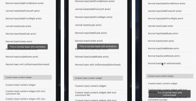
The package can be used to create beautify toast with a series of animations.
StyledToast(
  locale: const Locale('en', 'US'),  //You have to set this parameters to your locale
  textStyle: TextStyle(fontSize: 16.0, color: Colors.white), //Default text style of toast
  backgroundColor: Color(0x99000000),  //Background color of toast
  borderRadius: BorderRadius.circular(5.0), //Border radius of toast
  textPadding: EdgeInsets.symmetric(horizontal: 17.0, vertical: 10.0),//The padding of toast text
  toastPositions: StyledToastPosition.bottom, //The position of toast
  toastAnimation: StyledToastAnimation.fade,  //The animation type of toast
  reverseAnimation: StyledToastAnimation.fade, //The reverse animation of toast (display When dismiss toast)
  curve: Curves.fastOutSlowIn,  //The curve of animation
  reverseCurve: Curves.fastLinearToSlowEaseIn, //The curve of reverse animation
  duration: Duration(seconds: 4), //The duration of toast showing
  animDuration: Duration(seconds: 1), //The duration of animation(including reverse) of toast
  dismissOtherOnShow: true,  //When we show a toast and other toast is showing, dismiss any other showing toast before.
  movingOnWindowChange: true, //When the window configuration changes, move the toast.
  fullWidth: false, //Whether the toast is full screen (subtract the horizontal margin)
  child: MaterialApp(
          title: appTitle,
          showPerformanceOverlay: showPerformance,
          home: LayoutBuilder(
            builder: (BuildContext context, BoxConstraints constraints) {
              return MyHomePage(
                title: appTitle,
                onSetting: onSettingCallback,
              );
            },
          ),
        ),
);