The gauge chart, or also known as a dial chart or speedometer chart, is considered one of the most popularly used graphs to signify progressive values. It looks like a dial with a needle that is pointing to a specific value. Usually, the dial had diverse shades that separate the scale into many parts and allows you to get an understanding of the data.
Table of Contents
What is a Gauge Chart?
A gauge chart conveys the status or progress of a process. It usually has a single data point on one axis and two scales on the other that are perpendicular to each other, with one acting as an indicator for completion (e.g., 100% – Complete) and another indicating what is left to be completed. Gauge charts can also represent something like public opinion over time by using varying colors instead of values.
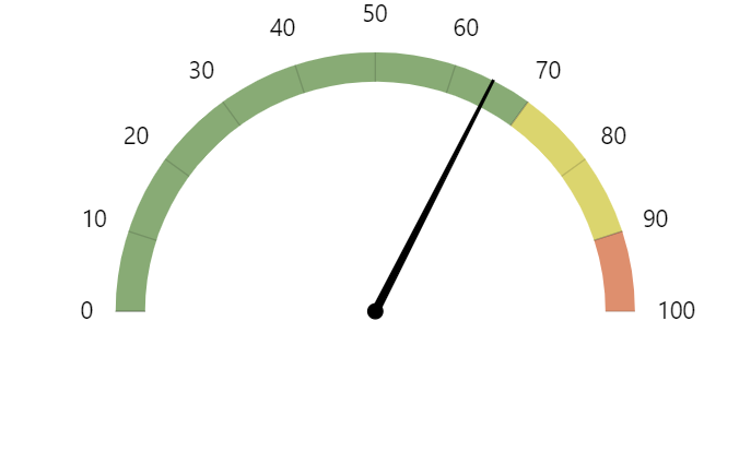
The gauges in these types of graphs have either numeric values or icons which correspond to different states such as “not started”, “in progress” and so forth, while the vertical axis corresponds to percentage complete (<100%). The unique feature about this type of graph is that once it reaches completion, you don’t need to rely on the axis values to tell you that it is complete.
Because of the extensive and simplicity usage, this chart can be used in all conditions such as:
- Once you have a linear array of progressive data and you need to depict it changes
- Used in sales and advertising to portray targets and how it has been obtained
- Widely utilized in project management to express deadlines, modules as well as related information
- Used in economic and finance to signify statistics as well as researched information
- This is also utilized for competitive evaluation or if you want to assess the modification of diverse entities
- This chart is also utilized in an executive dashboard to stand for important indicators associated with any domain. This is why this chart is utilized in healthcare and academic, HR, analysis as well as any fields.
Advantages and Disadvantages of Using Gauge Charts
Like other types of chars, a gauge chart also comes with pros and cons such as:
Pros
- Easy to make a chart
- You are able to depict linear progressive scales on this chart with no scope of an unexpected problem, such as parallax error
- This is user-friendly. Thus the audience can comprehend it without needing further explanation
- You can differentiate values easily by coloring the dial
Cons
- This char can take more space to stand for a handful of information
- Difficult to represent complex information or many scales
- Not able to depict the modification in many variables
- There are instances when this chart can lack a central context