Imagine a canvas where data comes alive – a canvas that paints a vivid picture of evolving trends and reveals hidden stories within numbers. That’s precisely what an area chart does. But what is an area chart?
Table of Contents
What is an Area Chart?
At its core, an area chart is a data visualization technique that represents quantitative data over time or categories. By enclosing data points within filled areas and connecting them with lines, this chart creates a captivating visual display that facilitates effortless comprehension of complex information.
Area charts are a popular data visualization tool used to display quantitative data over time or in different categories. They are particularly effective in illustrating trends and patterns in data, making them valuable in various domains such as finance, marketing, and research.
An area chart is a type of bar chart, usually with axes on the vertical and horizontal. Area charts are typically used to illustrate change over time. The area between the two lines indicates that there has been some form of growth or decline in value for the period represented by each data point (usually a year).
In this way, it is similar to a line graph, but unlike a line graph, an area chart can show both positive and negative changes so long as they are balanced on either side against one another.
The space under an up-trending curve may be shaded light green; similarly, any down-trending areas would also be shaded dark brown. This shading gives viewers more information about what kind of movement is taking place over the entire duration of time represented by a given chart, rather than just at one point in time.
An area chart is used to represent the change in a quantity within a specific period of time. Similar to a line graph, the data points are plotted and connected by a line segment. This is done to present the value of one or more quantities over time.
For that reason, many people are quite confused between a line graph and an area chart. But they are different. Area charts, for example, have an area that’s filled with shading or color.
Types of Area Charts
Basic Area Chart
The basic area chart is the fundamental type that serves as the foundation for other variations. It consists of a series of data points connected by line segments and enclosed by a colored area, representing the extent of the data values.
This chart is typically used to compare the overall trend or magnitude of multiple datasets over time. It is a powerful tool for highlighting changes and identifying patterns within a given data set.
Stacked Area Chart
The stacked area chart builds upon the basic area chart by stacking multiple datasets on top of each other, emphasizing the cumulative total rather than individual values. Each area segment represents a different category or component of the total, with the overall area indicating the sum of all the stacked values.
Stacked area charts are useful when you want to show the composition and relative proportions of different data sets, making them ideal for visualizing market share, resource allocation, or population demographics.
Streamgraph
The streamgraph is a variation of the stacked area chart that emphasizes the flow and evolution of data over time. Instead of using straight lines to connect the data points, the streamgraph utilizes smoothed, flowing curves. The width of the curves represents the varying proportions of the data sets, while the vertical axis displays the magnitude of the values.
Streamgraphs are particularly effective in illustrating the changing relationships between different categories and how they contribute to the overall trend.
100% Stacked Area Chart
The 100% stacked area chart is a variation of the stacked area chart that normalizes the data, allowing for a comparison of relative proportions across multiple datasets. The areas are scaled to 100%, which means each segment represents the percentage contribution of a specific category or component to the total.
This chart is valuable when you want to compare the distribution patterns or the relative importance of different elements within a whole.
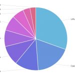
Radial Area Chart
The radial area chart breaks away from the traditional linear representation by using a circular layout. It displays the data values along the circumference of the circle, with the areas filled to represent the magnitude of the values.
Radial area charts are particularly effective in showcasing cyclic or periodic patterns, as the circular arrangement allows for easy identification of repeating trends. They are often used in fields such as astronomy, climate science, and economics.
Area Chart Usage
Tracking Trends over Time
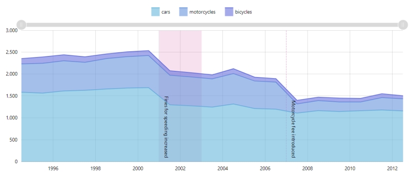
One of the primary uses of area charts is to track trends and changes in data over time. By plotting data points on a time axis and connecting them with line segments, area charts provide an intuitive representation of how values evolve. They allow viewers to quickly grasp the overall trajectory of a dataset and identify any significant shifts or patterns. This makes area charts particularly useful in analyzing financial data, market trends, population growth, and other time-dependent phenomena.
For example, an area chart can effectively showcase the rise and fall of stock prices over a specific period. The filled areas provide a clear visualization of the magnitude of price fluctuations, while the lines connecting the data points highlight the overall trend.
Comparing Multiple Data Series
Area charts are also valuable when comparing multiple data series or categories. By stacking the areas on top of each other, either proportionally or as a cumulative total, you can visually compare the contribution of each series or category to the whole. This is particularly useful in analyzing market share, resource allocation, or demographic distributions.
For instance, a stacked area chart can illustrate the market share of different smartphone brands over time. Each stacked area represents a brand, and the vertical extent of the area indicates its market share. By examining the changes in the areas over time, one can quickly identify the brand dynamics within the market.
Highlighting Proportions and Percentages
The 100% stacked area chart is an excellent option when you want to emphasize the relative proportions or percentages of different categories or components within a whole. By scaling the areas to 100%, each segment represents the percentage contribution of a specific category. This enables a clear comparison of the distribution patterns and helps identify any significant variations in proportions.
For example, a 100% stacked area chart can showcase the sales distribution of various product categories in a retail store. The chart allows viewers to observe how the proportions of different categories change over time and identify the most significant contributors to total sales.
Visualizing Patterns and Cyclic Trends
The streamgraph and radial area chart are variations of the traditional area chart that excel in visualizing patterns and cyclic trends. The streamgraph replaces the straight lines connecting data points with smooth, flowing curves. This provides a sense of continuous flow and reveals the changing relationships between different categories or components.
On the other hand, the radial area chart breaks away from the linear representation by using a circular layout. It is particularly useful for showcasing cyclic or periodic patterns. By arranging data values along the circumference of the circle and filling the areas, the radial area chart enables easy identification of repeating trends.
Both the streamgraph and radial area chart find applications in fields such as climate science, astronomy, and economic analysis.