Charts play a vital part in dealing with or working with data. This helps in condensing big data into a simple and understandable format. Data visualization can bring out the idea to those looking at the information for the first time. There are many kinds of charts available for visualization; each one can be used in a different situation. Often, the most challenging part of making data for visualization is knowing which type of chart is ideal for the job.
What is a Chart or Graph?
A chart or graph is a representation of data in the form of points plotted on an axis or two axes. The type of graphing used depends on what information you want to display, such as time-related graphs for stocks and other financial transactions, contour maps that show three dimensions with height represented by color variations, and bar charts that require scrolling.
Charts/Graphs are also typically categorized into types based on their most common usage: line graphs (to represent trends over time), scatter plots (for exploring relationships between variables), etc.
17 Different Types of Charts and Graphs for Showing Data
There are many different types of charts and graphs you can use to display data or information. The key is to find what works best for the type of content, audience, and message you want to portray.
To make things easier for you, we will break down some of the most popular charts you can use for visualization. So, here they are!
Bar Chart
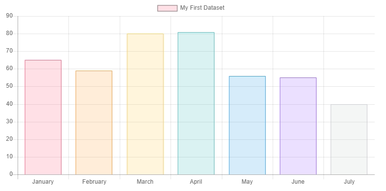
In this type of char, values are shown via the length of bars that match up with a measured group. A bar chart is oriented either horizontally or vertically; a vertical type is called a column chart, while a horizontal is the best choice if you have many bars to plot.
Line Charts
This chart shows value modification in continuous measurements, and the up and down movement of the line helps you bring negative and positive changes. It can also show overall trends to assist readers in coming up with projections or guess for future results.
Scatter Plot
This type of chart shows values on two numerical variables using points placed on two axes, one for every variable. A scatter plot graph is a flexible expression of the connection between plotted variables; it doesn't matter if it is positive or negative, weak or strong, or linear or non-linear. This is ideal for knowing outlier points.
Box Plot
A type of chart that utilizes whiskers and boxes to break down the allocation of values in a measured group is called a box plot. The whisker ends, and the box's positioning displays areas where the greater part of the data lies.
Stacked Bar Chart
This is an alteration of the typical bar chart that is separated each bar into many smaller ones based on a value of another grouping variable. This helps compare primary group values and shows a relative breakdown of every group's whole into constituent parts.
Grouped Bar Chart
However, this bar doesn't allow for evaluation of the primary group total but does a better job of enabling measuring sub-groups.
Dot Plot
The same as the bar chart, Dot Plot designates values for diverse categorical groupings; however, encoded rates are based on the position of the point instead of the length of the bar. This is valuable if you want to measure across categories; however, zero baselines aren't useful or instructive. This is also comparable to a line plot that has a line eliminated so it can be utilized with variables with no order classifications instead of just ordered or continuous variables.
Area Chart
This begins with a similar base like a line chart- a value point linked by segments of the line- however, puts in concepts from the chart with shadowing between a baseline and the line. This is used in combination with the stacking to determine how the total has changed.
Dual Axis
This type of chart overlays various charts with a communal flat axis, however potentially different upright axis scale. This is valuable in showing a straight comparison between sets of upright values, at the same time, integrating the horizontal axis variable context.
Bubble Chart
This is a multivariate chart alternative to a scatter plot. Barring the value of a variable shown by the X and Y axes, every bubble's area represents the third value.
Gauge
This is a type of materialized graph, in which scale stands for the metric, while pointer stands for dimension. The pointer angle symbolizes the value and can represent the actual situation or progress of a pointer.
Radar Chart
This is utilized to compare many quantized variables like seeing which have similar values or extreme values. This chart helps in observing the variable within the data set, which has lower or higher values. This is perfect for showing performance at work. Also, this chart comes with a stacked style of column, which can be utilized for dual-way comparison between series and classification, at the same time representing the part. This is ideal in dimension analysis, series weight analysis, as well as series comparison.
Frame Diagram
This type of chart is a visual way of showing the ladder in the type of tree structure that visibly shows the ladder's connection.
Rectangular Tree Diagram
This type of chart is used for showing information or statistic with ladder connections that can visibly reflect the contrast between similar levels. Unlike the conventional tree structure graph, this one makes a more efficient application of space with the function of representing the proportion. This type of chart is ideal for showing a hierarchy that has weight connections when it's not needed to reflect the part.
Compared with the traditional tree structure diagram, the rectangular tree diagram makes more efficient use of space and has the function of showing proportion.
Funnel Chart
A funnel chart displays t the part of every level and reflects the dimension of every module. A funnel chart is ideal for measuring rankings. What s more, it can also be utilized for comparison; when you arrange it in straight form, the data's difference is clear.
Word Cloud Chart
This is a visual depiction or symbol of text statistics. As the name suggests, it looks like a cloud compiled of vocabulary. Word Cloud Chart is utilized to show a remarkable amount of text data as well as can instantly assist you in understanding the important text.
This type of chart needs a huge amount of data as well as the level of data discrimination is large, or else the effect is not visible. Word Cloud Chart is not ideal to use for precise analysis.
Gantt Chart
This type of char displays mission timing, actual development, as well as requirements comparison. So, supervisors can easily comprehend the development of a job.
Conclusion
These are just some of the most popular types of chars for visualization. Make sure to use one that meets your needs.
Comments