The pie chart is a data representation using a circular graph. It is also referred to as a circle chart. The graph’s pieces are proportional to the fraction of the whole in each classification or category. In other terms, each slice of the pie is related to the size of the category in the group as a whole.
What is Pie Chart?
Pie charts are simple, yet powerful graphs that allow you to reveal proportions and compare values. Pie charts divide a circle into many slices with each slice representing the proportional value of an item.
The pie chart represents 100 percent of the whole, and the slices are the representation of the portions of the whole.
For example, if we wanted to make a pie chart illustrating the types of dessert people eat at restaurants in America, then our graph would have six different sections: ice cream (25%), cheesecake (20%), cake (15%), tiramisu (12%), pudding or flan (11%) and tres leches cake or spongecake layered with whipped cream filling and dulce de leche sauce(ten percent). The total sum is 100%.
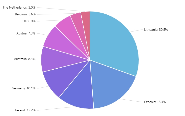
A common mistake when drawing pie charts is not using enough categories so there’s too many small slices and the percentages become hard to read.
What is the Use of Pie Chart?
A pie chart can be used in:
- Business to compare different growth areas like profit, turnover, and exposure
- It is also used for the representation of categorical data
Benefits of Using Pie Chart
One advantage of using a pie chart is that it is very easy to understand. It can represent a data as a fractional part of the whole. With this chart, you can offer a data comparison at a glance.
Disadvantages of Using Pie Chart
On the other hand, sometimes a pie chart is less effective, especially if there are lots of data pieces to use. It became crowded and hard to understand. Since it represents one set of data, you need a comparison of different sets.
Formula of a Pie Chart
With a pie chart, you can represent data through different portions of a whole. The total of the data is about 360 degrees. The pie chart always has 100% total value.
To identify the percentage of the pie chart, consider the steps below:
- Categorize the information
- Calculate the total
- Divide the data into categories
- Convert it to percentages
- Lastly, calculate the degrees
The formula for a pie chart is: (Data given/Total value of data) x 360 degrees
Conclusion
A pie chart is easy to understand and perfect to use for comparison of one set data. You can manipulate the data pieces in the pie chart.
Comments