SweetAlert is a javascript library that makes popup messages easy and pretty.
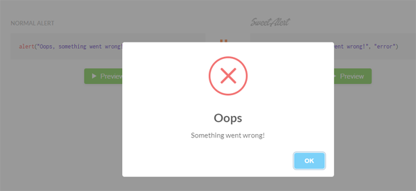
Table of Contents
Download and Install
//use npm
npm install sweetalert
//use CDN: you can also find SweetAlert on unpkg and jsDelivr and use the global swal variable.
https://unpkg.com/sweetalert/dist/sweetalert.min.js
SweetAlert Examples
//a sweet alert with only title and content
swal("A title", "Content goes here");

//more configurations
swal({
title: "Popup title",
text: "Congratulations! The article was updated successfully.",
icon: "success",
button: {
text: "Confirm",
value: true,
visible: true,
className: "",
closeModal: true,
},
className: "customClass",
closeOnClickOutside: false,
closeOnEsc: false,
dangerMode: true,
timer: 5000,
});

//with forms
swal({
content: {
element: "input",
attributes: {
placeholder: "Your Age",
type: "number",
},
},
});
- title: the title of the modal
- text: the main content of the modal
- icon: there are 4 built-in icons that you can use – success, info, warning, and error.
- button: this is the default confirm button. If you want to replace both the cancel and confirm buttons, you need to use buttons parameter.
- className: apply a custom class name to the modal.
- closeOnClickOutside: determine whether the modal is closed if the user clicks outside of the modal.
- closeOnEsc: determine whether the modal is closed when the user presses Escape.
- dangerMode: this is useful to show the warning messages. If this value is set to true, confirm button’s background is turned into red.
- timer: the modal is closed after x milliseconds.
