It’s been a while since the world has seen a radical shift in how content is displayed on screens, but that time may be coming soon. The mobile era introduced us to responsive design as the norm for viewing content across different screen sizes and resolutions. Now we’re experiencing an even more radical shift with wearables such as smartwatches which will require yet another new way of displaying content.
Nowadays an app is required to have suitable layout for each screen size, esp. when Flutter can produce apps for multiple screen sizes with the same code base.
Flutter offers LayoutBuilder widget which can build a widget tree that can depend on the parent widget’s size. When parent widget changes its width and height, LayoutBuilder will act accordingly to change its size to match the parent’s size.
The example below shows how to use Row or Column depends on screen’s width.
class HomePage extends StatefulWidget {
  @override
  _HomePageState createState() => _HomePageState();
}

class _HomePageState extends State<HomePage> {
  @override
  Widget build(BuildContext context) {
    return Scaffold(
      appBar: AppBar(
        title: Text('Layout Builder'),
      ),
      backgroundColor: Colors.white,
      body: SafeArea(
        child: Container(
          width: MediaQuery.of(context).size.width,
          height: 300,
          color: Colors.blue,
          child: LayoutBuilder(
            builder: (BuildContext context, BoxConstraints constraints) {
              if (constraints.maxWidth > 600) {
                return Row(
                  mainAxisAlignment: MainAxisAlignment.center,
                  children: <Widget>[
                    Text('Text'),
                    FlutterLogo(size: 200,)
                  ],
                );
              } else {
                return Column(
                  mainAxisAlignment: MainAxisAlignment.center,
                  children: <Widget>[
                    Text('Text'),
                    FlutterLogo(size: 200,)
                  ],
                );
              }
            }
          ),
        )
      ),
    );
  }
}
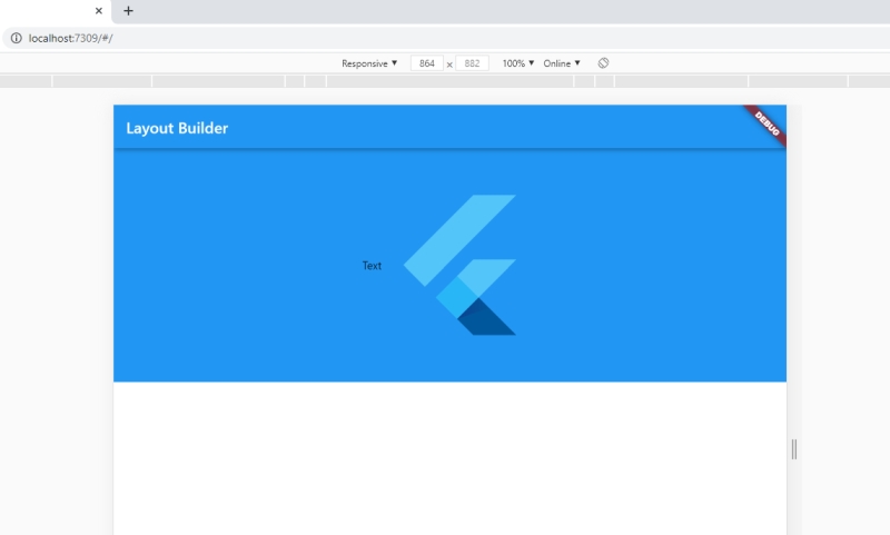
Result when parent’s width is bigger than 600
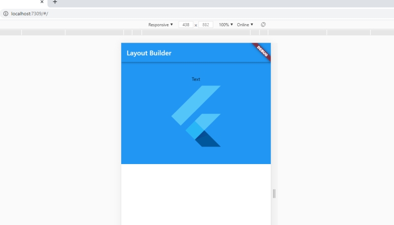
Result when parent’s width is smaller
