Web design is a constantly evolving field. There are always new techniques, tricks and trends being introduced that can help you stand out from the competition. And while many of these changes are subtle, they can have a huge impact on your website’s conversion rates if executed correctly. In this blog post, we will explore five web design tips that will make your website look professional and modern.
In this blog post, we will be discussing 5 important tips that can make your website stand out. These are simple and easy to implement web design suggestions that you should consider when building or redesigning your website. The first tip is a no-brainer: make sure the font on your site is legible!
Table of Contents
Font and Text
Your website’s font should be legible. This is a pretty straightforward design tip that can help people read your content more easily, but it also helps you stay on brand and makes the site feel modern. When picking fonts, use common web safe fonts like Arial or Verdana for body copy in order to avoid any issues with older browsers not displaying text properly.
The second essential web design tip we’re going to cover today is making sure form labels match their respective inputs so users know what information they need to provide when filling out forms on your site. This will make your forms look much cleaner and reduce confusion among visitors who may have trouble understanding which fields are required and which ones aren’t (or might even get confused if they need to enter information into a field that’s not labeled!).
The third web design tip is making sure your site has sufficient whitespace. This may seem like an odd suggestion, but it can actually have a huge impact on how people perceive the content and interact with your website. Whitespace in general makes things feel lighter and more spacious, which will make visitors less likely to leave your page feeling overwhelmed or frustrated by all of the clutter. Using negative space in conjunction with positive space also helps create balance between elements on the screen while drawing attention where you want it so everything feels well-organized without being overwhelming.
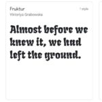
Another essential web design tip we’ll be discussing today is using typography correctly for maximum effect! The way you use typography on your site will affect how people feel about your company and can make a huge difference in the overall design. For instance, using all caps for text might seem like an attention-grabbing technique but it’s actually very hard to read because of how letters are spaced apart from one another. This is why we recommend sticking with lowercase typefaces instead!
Lastly, you want to make sure all animations on the page are subtle enough not to distract visitors from whatever they’re reading. We recommend only adding animation effects sparingly because too much movement will cause frustration and overwhelm viewers who just want quick information without any fuss (for example).
Use Bulleted Lists Whenever Possible
Bulleted lists are a great way to make content easier to read on the web. Whenever you have important points that need to be included in your post, try using numbered or bulleted lists rather than paragraphs so it’s easier for people to skim and find what they’re looking for more quickly.
This is more about readability and clarity than anything else. We recommend using bulleted lists whenever possible on your site, as they make it easier to skim and find what you’re looking for more quickly or just read things in general without getting lost in a long paragraph with no visual breaks.
Be sure not to use any numbering like bullet points because that would take away from the content.
Include Social Media Sharing Buttons
You should also include share buttons on your site so people can easily tell their friends about your content. This is essential for building up an engaged following, as well as boosting traffic to the site in general! For instance, Facebook recommends using a variety of social media buttons like “Like” or “Tweet” that are easy to spot and interact with when scrolling through posts.
Keep Navigational Links Close To The Top of Your Pages
Another web design tip is to make sure navigational links are present on all of your pages so visitors don’t have to scroll through the entire site in order to find what they’re looking for.
This can also help improve overall user experience because people will be less frustrated by having to use a lot of unnecessary scrolling and more likely stay engaged with whatever content you’ve created!
Choose A Background Image That Matches Your Brand
The final web design tip is choosing a background image that matches your brand. It’s important to make sure the colors on your site are cohesive and in line with what you’re trying to portray as an organization or company, so people know they can trust you right away!
For instance, if someone visits your website for the first time and sees a bright pink color scheme then it will be difficult to tell whether this is supposed to be taken seriously.
So unless there’s some kind of joke being made here (which would need proper warning), we recommend opting for something more neutral like gray tones instead, which may also seem less harsh on visitors’ eyes after scrolling through content all day long.


Good design is essential if you want to make your website unique.