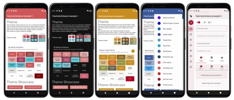
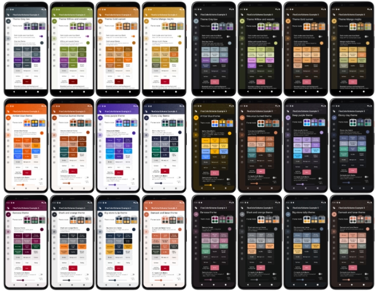
flex_color_scheme allows developers to create beautiful color scheme for Flutter application with optional primary color branding on code. The themes created with FlexColorScheme package use the same concept as Flutter’s ColorScheme based themes, but with more features and easier to handle the whole app’s theme.
If you have been styling a Flutter app for a while, you will know the pain of how inconsistent of Flutter’s theme property is. They are spread across many properties which make it a pain to manage.
FlexColorScheme comes with 28 built-in example schemes with both light and dark versions that you can use in your applications out-of-the-box.
Install:
flex_color_scheme: ^2.1.1Define color scheme in MaterialApp’s properties:
class MyApp extends StatelessWidget {
// This widget is the root of your application.
@override
Widget build(BuildContext context) {
return MaterialApp(
title: 'Flutter Demo',
debugShowCheckedModeBanner: false,
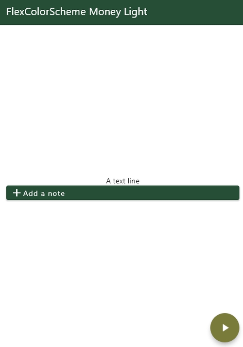
theme: FlexColorScheme.light(scheme: FlexScheme.money).toTheme,
darkTheme: FlexColorScheme.dark(scheme: FlexScheme.money).toTheme,
themeMode: ThemeMode.system,
home: HomePage(),
);
}
}
import 'package:flutter/material.dart';

class HomePage extends StatefulWidget {
  @override
  _HomePageState createState() => _HomePageState();
}

class _HomePageState extends State<HomePage> {
  @override
  void initState() {
    super.initState();
  }

  @override
  Widget build(BuildContext context) {
    return Scaffold(
      appBar: AppBar(
        title: Text('AnimatedDefaultTextStyle'),
      ),
      body: SafeArea(
          child: Container(
        padding: EdgeInsets.all(16.0),
        child: Column(
            mainAxisAlignment: MainAxisAlignment.center,
            crossAxisAlignment: CrossAxisAlignment.center,
            children: [
              Text('A text line'),
              ElevatedButton(
                  onPressed: () {},
                  child: Row(children: [Icon(Icons.add), Text('Add a note')]))
            ]),
      )),
      floatingActionButton: FloatingActionButton(
        onPressed: () {},
        child: Icon(Icons.play_arrow, color: Colors.white),
      ),
    );
  }
}