DropDownButton is a widget that you can use to implement a menu in your app. It’s an easy way to add buttons and other items for the user to interact with, without having to create complex layouts or write code. DropDownButtons are also fully customizable; it’s easy to change the font size, color, shape and more.
DropdownButton widget consists a list of DropdownMenuItem. It shows the currently selected item and an arrow that opens a menu for selecting another item.
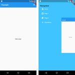
In this example, we’ll create a simple button in Flutter. A dropdown button is a button that can be used for navigation purposes or as an input field. You will see how easy it is to add nice animations and customize the appearance of your buttons with Material Design principles in mind.
Table of Contents
A simple DropdownButton
A simple widget consists of list of String and its respective value.
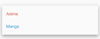
String _selectedValue;DropdownButton<String>(
value: _selectedValue,
isExpanded: true,
items: [
DropdownMenuItem<String>(
value: "anime",
child: Text(
"Anime",
style: TextStyle(color: Colors.red),
),
),
DropdownMenuItem<String>(
value: "manga",
child: Text(
"Manga",
style: TextStyle(color: Colors.blue),
),
),
],
onChanged: (value) {
setState(() {
_selectedValue = value;
});
},
hint: Text(
"Category",
),
)Set DropdownButton values from a list
The list can be a list of primitive Data Types or Object.
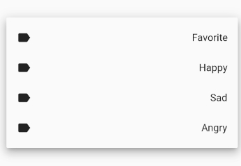
final List<String> categories = ['Favorite', 'Happy', 'Sad', 'Angry'];
String _selectedValue;
DropdownButton<String>(
value: _selectedValue,
isExpanded: true,
items: categories.map((e) {
return DropdownMenuItem<String>(
value: e,
child: Row(
mainAxisAlignment: MainAxisAlignment.spaceBetween,
children: [
Icon(Icons.label),
Text(e)
],
),
);
}).toList(),
onChanged: (value) {
setState(() {
_selectedValue = value;
});
},
hint: Text(
"Category",
),
)