As a web designer or developer, one should understand that having a deep understanding of CSS is imperative to creating beautiful websites. Cascading Style Sheets (CSS) is the basis of website development and design. Are you a web designer? Take note of the importance of having a basic understanding of CSS.
There are many resources and tools out there to help you learn CSS. This post will review a few of the best ones for beginners, intermediate learners, and experts looking to find new ideas. I have compiled a list of the best resources to help you learn CSS. Whether you are looking for a place to start, or want to brush up on your skills, this blog post will give you all the information you need!
Table of Contents
Tutorials and Courses
CSS
- Build Websites from Scratch with HTML & CSS – Another course from Udemy, this one is composed of over seventy-seven lectures and eight hours of content, presenting you with a basic, yet inclusive understanding of both CSS and HTML. The course specializes in having you start creating code so you could learn through doing, and make your own functional CSS and HTML webpage at the end.
- CSS Learning Path (from Beginner to Advanced) – This CSS tutorial helps you learn everything from cascading and inheritance in CSS, layouts with CSS, CSS3 components features, and SASS & LESS, among others. The learning path will bring you from the fundamentals of CSS to a live coding session.
- CSS: Refactoring Style Sheets – Led by web designer and web developer Morten Rand-Hendriksen, this CSS course aims to talk about how to make stylesheets leader while keeping the stylesheets power. He will cover tools such as Gulp, Purgecss, Code, Visual Studio, Prettier, stylelint, and nmp.
- Learn to Code HTML & CSS – This CSS online course is an interactive guide for beginners with one goal. It strives to teach you how to create and style websites with CSS and HTML. It will outline the basics and covers all the vital elements of front-end designs as well as development.
- The Complete Flexbox Tutorial – This tutorial from Udemy aims to teach you how to utilize the new CSS3 Flexbox model to make responsive web layouts efficiently. Topics from how to write quality and reusable CSS codes to wonderful responsive galleries with Flexbox are tackled in this lesson.
LESS
LESS is a CSS pre-processor that enables customizable, manageable, and reusable style sheets for websites.
- Lesscss – Getting started with configuration, and basic usage of LESS.
- Learning LESS – This course will guide you through the basics of setting up LESS within your workflow, understanding variables and how to use them, and creating maintainable CSS using mixins and extends.
SASS
Sass lets you use features that don’t exist in CSS yet like variables, nesting, mixins, and inheritance that make writing CSS faster and more robust.
- Sass-lang – This site is all you need to learn about Sass and Scss.
- Advanced CSS and Sass – Through this course, you will learn tons of modern CSS techniques to create stunning designs and effects.
Tools
- Bourbon – Bourbon is a lightweight Sass tool set. It is pure Sass.
- RSCSS – Styling CSS without losing your sanity.
- ITCSS – A sane, scalable, managed CSS architecture for large UI projects.
- idiomatic CSS – The following document outlines a reasonable style guide for CSS development.
- CSS Guidelines – High-level advice and guidelines for writing sane, manageable, scalable CSS.
- Sass Guidelines – An opinionated style guide for writing sane, maintainable, and scalable Sass.
Modern CSS Layouts
Super center
With place-items: center, content inside the wrapper will be placed at the middle center.
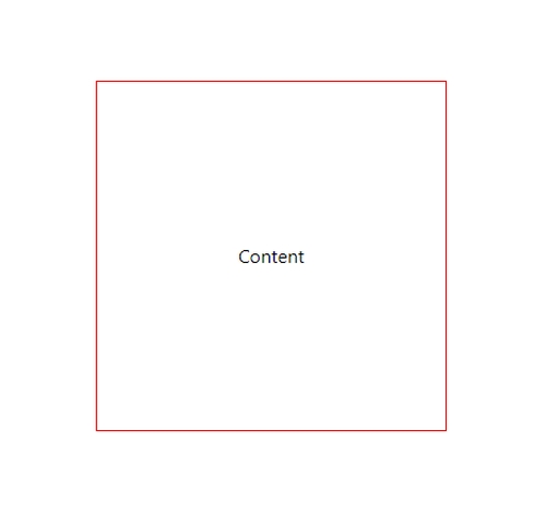
.wrapper{
	display: grid;
	place-items: center;
	height: 300px;
	width: 300px;
	margin: 100px auto;
	border: 1px solid red;
}
Responsive with flex
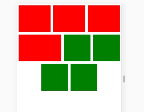
<div class="wrapper">
		<div class="box-stretched"></div>
		<div class="box-stretched"></div>
		<div class="box-stretched"></div>
		<div class="box-stretched"></div>
		<div class="box-no-stretched"></div>
		<div class="box-no-stretched"></div>
		<div class="box-no-stretched"></div>
		<div class="box-no-stretched"></div>
	</div>
.wrapper{
	display: flex;
	flex-wrap: wrap;
	justify-content: center;
}
.wrapper .box-stretched {
	background: red;
	width: 100px;
	height: 100px;
	margin: 5px;
	flex: 1 1 100px;
}

.wrapper .box-no-stretched {
	background: green;
	width: 100px;
	height: 100px;
	margin: 5px;
	flex: 0 1 100px;
}
Sidebar with grid-template-columns
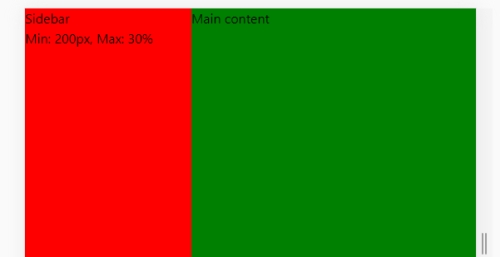
<div class="wrapper">
		<div class="sidebar">Sidebar<br>Min: 200px, Max: 30%</div>
		<div class="content">Main content</div>
	</div>
.wrapper{
	display: grid;
	grid-template-columns: minmax(200px, 30%) 1fr;
	height: 300px;
}

.wrapper .sidebar{
	background-color: red;
}
.wrapper .content{
	background-color: green;
}
Grid area
The grid-template-areas CSS property specifies named grid areas, establishing the cells in the grid and assigning them names.
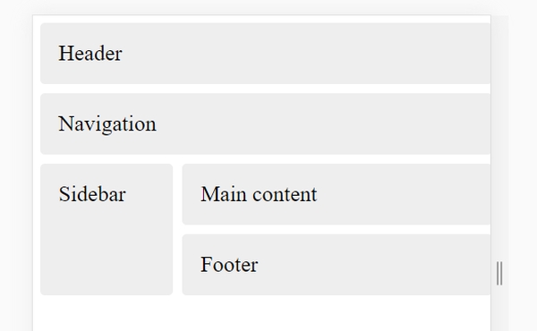
<div class="wrapper">
	<header class="box">Header</header>
	<nav class="box">Navigation</nav>
	<div class="sidebar box">Sidebar</div>
	<main class="box">Main content</main>
	<footer class="box">Footer</footer>
</div>
.sidebar {
	grid-area: sidebar;
}
nav{
	grid-area: nav;
}
main {
	grid-area: content;
}

header {
	grid-area: header;
}
footer {
	grid-area: footer;
}
.wrapper {
	display: grid;
	grid-gap: 10px;
	grid-template-columns: 30%  70%;
	grid-template-areas:
           "header  header" "nav nav" "sidebar content" "sidebar footer";
}

.box {
	background: #EEE;
	border-radius: 5px;
	padding: 20px;
	font-size: 150%;

}