Text is one of the most popular widgets in Flutter. There are many features we want the widget can support. Therefore, we need these best Text libraries for our Flutter apps.
Table of Contents
auto_size_text
Text is bound by font size. This widget can display text that automatically resizes its font size to fit perfectly within its bounds.
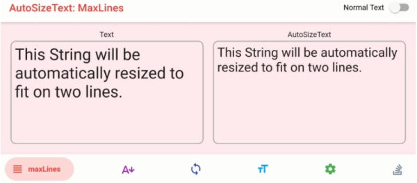
//fit in 2 lines
AutoSizeText(
  'This String will be automatically resized to fit on two lines',
  style: TextStyle(fontSize: 20),
  maxLines: 2,
)
//fit in 4 lines, the rest becomes ellipsis
AutoSizeText(
  'A really long String',
  style: TextStyle(fontSize: 30),
  minFontSize: 18,
  maxLines: 4,
  overflow: TextOverflow.ellipsis,
)
//group: All Text in the same group will fit their boundaries and have the same size.
var myGroup = AutoSizeGroup();

AutoSizeText(
  'This is 1st text from myGroup',
  group: myGroup,
);

AutoSizeText(
  'This is 2nd text from myGroup',
  group: myGroup,
);
//presets: size is reduced based on presetFontSizes
AutoSizeText(
  'This string will resize its font size according to presetFontSizes',
  presetFontSizes: [40, 20, 14],
  maxLines: 4,
)
animated_text_kit
This library contains a collection of cool and awesome text animations. it supports these animation types: Rotate, Fade, Typer, Typewriter, Scale, Colorize, TextLiquidFill, and Wavy.
Row(
  mainAxisSize: MainAxisSize.min,
  children: <Widget>[
    SizedBox(width: 30.0, height: 100.0),
    Text(
      "Be",
      style: TextStyle(fontSize: 40.0),
    ),
    SizedBox(width: 20.0, height: 100.0),
    RotateAnimatedTextKit(
      onTap: () {
        print("Tap Event");
      },
      text: ["COOL", "STYLISH", "DIFFERENT"],
      textStyle: TextStyle(fontSize: 36.0, fontFamily: "Horizon"),
      textAlign: TextAlign.start
    ),
  ],
);
flutter_typeahead
This is an auto-completion text field widget for Flutter. It can suggest data based on what the user types in.
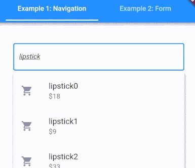
The widget shows suggestions in an overlay that floats on top of all other widgets. It provides a builder function to allow you to customize suggestions design and layout. There is a built-in event for users to interact with the suggested items.
TypeAheadField(
  textFieldConfiguration: TextFieldConfiguration(
    autofocus: true,
    style: DefaultTextStyle.of(context).style.copyWith(
      fontStyle: FontStyle.italic
    ),
    decoration: InputDecoration(
      border: OutlineInputBorder()
    )
  ),
  suggestionsCallback: (pattern) async {
    return await BackendService.getSuggestions(pattern);
  },
  itemBuilder: (context, suggestion) {
    return ListTile(
      leading: Icon(Icons.shopping_cart),
      title: Text(suggestion['name']),
      subtitle: Text('\$${suggestion['price']}'),
    );
  },
  onSuggestionSelected: (suggestion) {
    Navigator.of(context).push(MaterialPageRoute(
      builder: (context) => ProductPage(product: suggestion)
    ));
  },
)
flutter_linkify
This widget turns text URLs and emails into clickable inline links in the text. In combination with url_launcher, it can open URLs in a web browser.
Linkify(
  onOpen: (link) async {
    if (await canLaunch(link.url)) {
        await launch(link.url);
      } else {
        throw 'Could not launch $link';
      }
  },
  text: "My firts link by https://www.tldevtech.com",
  style: TextStyle(color: Colors.red),
  linkStyle: TextStyle(color: Colors.orange),
);
flutter_markdown
Flutter doesn’t use an HTML renderer like a web browser so a need for a WYSIWYG viewer arises. This package renders Markdown, a lightweight markup language, into a Flutter widget containing a rich text representation. flutter_markdown is built on top of the Dart markdown package.
//simple usage
Markdown(
    controller: controller,
    selectable: true,
    data: 'here is an emoji😀 ',
)
Img tag is supported but limited to URL, file, and resource.
extended_text
This package extends the official Text package to add more features. it can be used to build special text like inline images or @somebody quickly, it also supports custom background, custom overflow, and custom selection toolbar and handles.
It can show inline images by using ImageSpan as follows.
class ImageSpan extends ExtendedWidgetSpan {
  ImageSpan(
    ImageProvider image, {
    Key key,
    @required double imageWidth,
    @required double imageHeight,
    EdgeInsets margin,
    int start = 0,
    ui.PlaceholderAlignment alignment = ui.PlaceholderAlignment.bottom,
    String actualText,
    TextBaseline baseline,
    BoxFit fit= BoxFit.scaleDown,
    ImageLoadingBuilder loadingBuilder,
    ImageFrameBuilder frameBuilder,
    String semanticLabel,
    bool excludeFromSemantics = false,
    Color color,
    BlendMode colorBlendMode,
    AlignmentGeometry imageAlignment = Alignment.center,
    ImageRepeat repeat = ImageRepeat.noRepeat,
    Rect centerSlice,
    bool matchTextDirection = false,
    bool gaplessPlayback = false,
    FilterQuality filterQuality = FilterQuality.low,
    GestureTapCallback onTap,
    HitTestBehavior behavior = HitTestBehavior.deferToChild,
  })
blinking_text
if you want to create a blinking text with configurable duration, counter, and color, this library is a good choice. It is suitable to notify users about new items.
BlinkText(
	'New Product',
	style: TextStyle(fontSize: 12.0, color: Colors.black),
	endColor: Colors.red,
),