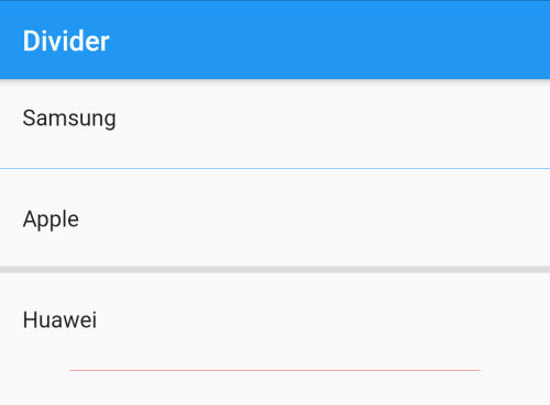
Divider is a thin horizontal line, with padding on either side. Dividers can be used in any widget which contains multiple children such as lists, Drawers, Column, and Row to separate content.
Table of Contents
Divider()
A divider line can be created with just Divider().
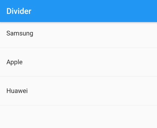
ListView(
          children: [
            ListTile(
              title: Text('Samsung'),
            ),
            Divider(),
            ListTile(
              title: Text('Apple'),
            ),
            Divider(),
            ListTile(
              title: Text('Huawei'),
            ),
            Divider(),
          ],
        )
ListView(
          children: [
            ListTile(
              title: Text('Samsung'),
            ),
            Divider(color: Colors.blue,),
            ListTile(
              title: Text('Apple'),
            ),
            Divider(thickness: 5.0,),
            ListTile(
              title: Text('Huawei'),
            ),
            Divider(color: Colors.red, indent: 50, endIndent: 50),
          ],
        )
VerticalDivider()
VerticalDivider is a thin vertical line, with padding on either side.
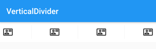
Container(
          padding: EdgeInsets.all(8.0),
          width: double.infinity,
          color: Colors.white,
          height: 50,
          child: Row(
            mainAxisAlignment: MainAxisAlignment.spaceBetween,
            children: [
              Icon(Icons.contact_mail_outlined),
              VerticalDivider(),
              Icon(Icons.contact_mail_outlined),
              VerticalDivider(),
              Icon(Icons.contact_mail_outlined),
              VerticalDivider(),
              Icon(Icons.contact_mail_outlined),
            ],
          ),
        )
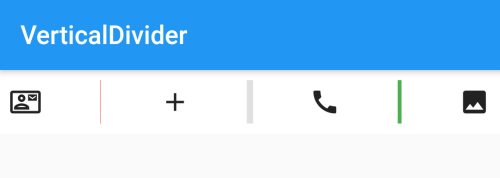
Container(
          padding: EdgeInsets.all(8.0),
          width: double.infinity,
          color: Colors.white,
          height: 50,
          child: Row(
            mainAxisAlignment: MainAxisAlignment.spaceBetween,
            children: [
              Icon(Icons.contact_mail_outlined),
              VerticalDivider(color: Colors.red),
              Icon(Icons.add),
              VerticalDivider(thickness: 5.0),
              Icon(Icons.call),
              VerticalDivider(thickness: 3.0, color: Colors.green),
              Icon(Icons.image),
            ],
          ),
        )