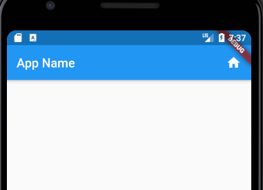
Appbar is a widget that contains the toolbar in a Flutter application. An app bar contains different toolbar widgets like menu button, actions, icon buttons and many more.
Table of Contents
Add a simple AppBar with action buttons
@override
Widget build(BuildContext context) {
    return Scaffold(
      appBar: AppBar(
        title: Text("App Name"),
        actions: <Widget>[
          Padding(
              padding: EdgeInsets.fromLTRB(0.0, 0.0, 16.0, 0.0),
              child: GestureDetector(
                onTap: () {
                  print("Calculator");
                },
                child: Icon(Icons.home),
              )),
        ],
      ),
      body: Padding(
        padding: EdgeInsets.only(right: 10.0),
      ),
    );
  }
Load AppBar from another file
AppBar needs to be loaded on every screen, so it is not a good idea to include it in each of it. We need to create a custom AppBar in a file then call it from any screens.
We create a widget call MainAppBar and call it from Scaffold like this.
 @override
  Widget build(BuildContext context) {
    return Scaffold(
      appBar: MainAppBar(title: Text(widget.title)));
  }


class MainAppBar extends StatelessWidget with PreferredSizeWidget {
  final Text title;
  final double barHeight = 50.0;

  MainAppBar({Key key, this.title}) : super(key: key);

  @override
  Size get preferredSize => Size.fromHeight(50.0);

  @override
  Widget build(BuildContext context) {

    return AppBar(
      title: title,
      actions: <Widget>[
        Padding(
            padding: EdgeInsets.fromLTRB(0.0, 16.0, 16.0, 0.0),
            child: GestureDetector(
              onTap: () {
                print("Calculator");
              },
              child: FaIcon(FontAwesomeIcons.calculator, size: 20),
            )),
        Padding(
            padding: EdgeInsets.fromLTRB(0.0, 16.0, 16.0, 0.0),
            child: GestureDetector(
              onTap: () {
                print("History");
              },
              child: FaIcon(FontAwesomeIcons.history, size: 20),
            )),
      ],
    );
  }
}
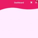
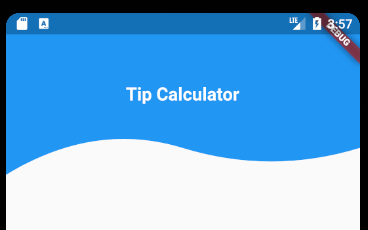
Wave Curved AppBar
Custom Clipper will be used to draw the wave curved path. In the WaveClip class you will see we draw the clip at 4 points: 0, 1/4 of the width, 3/4 of the width, and the width.
class MainAppBar extends StatelessWidget implements PreferredSizeWidget {
  final Text title;
  final double barHeight = 50.0;

  MainAppBar({Key key, this.title}) : super(key: key);

  @override
  Size get preferredSize => Size.fromHeight(kToolbarHeight + 100.0);

  @override
  Widget build(BuildContext context) {
    return PreferredSize(
        child: ClipPath(
          clipper: WaveClip(),
          child: Container(
            color: Colors.blue,
            child: Column(
              mainAxisAlignment: MainAxisAlignment.center,
              children: <Widget>[
                title,
              ],
            ),
          ),
        ),
        preferredSize: Size.fromHeight(kToolbarHeight + 100));
  }
}

class WaveClip extends CustomClipper<Path> {
  @override
  Path getClip(Size size) {
    Path path = new Path();
    final lowPoint = size.height - 30;
    final highPoint = size.height - 60;

    path.lineTo(0, size.height);
    path.quadraticBezierTo(
        size.width / 4, highPoint, size.width / 2, lowPoint);
    path.quadraticBezierTo(
        3 / 4 * size.width, size.height, size.width, lowPoint);
    path.lineTo(size.width, 0);

    return path;
  }

  @override
  bool shouldReclip(CustomClipper<Path> oldClipper) {
    return false;
  }
}