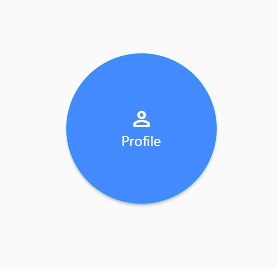
We use CircleBorder as the shape property of a MaterialButton to create a circular button in Flutter. Wrap the button with a fixed size Container to adjust its height and width.
import 'package:flutter/material.dart';

class HomePage extends StatefulWidget {
  @override
  _HomePageState createState() => _HomePageState();
}

class _HomePageState extends State<HomePage> {

  @override
  Widget build(BuildContext context) {
    return Scaffold(
      appBar: AppBar(
        title: Text('Circular button'),
      ),
      body: SafeArea(
        child: Center(
          child: Container(
            width: 150,
            height: 150,
            child: MaterialButton(
              shape: CircleBorder(side: BorderSide(width: 1, color: Colors.blue, style: BorderStyle.solid)),
              child: Column(
                mainAxisAlignment: MainAxisAlignment.center,
                children: [
                  Icon(Icons.perm_identity, color: Colors.white),
                  Text("Profile"),
                ],
              ),
              color: Colors.blueAccent,
              textColor: Colors.white,
              onPressed: (){
                print('clicked');
              },
            ),
          ),
        ),
      ),
    );
  }
}
InkWell(
  onTap: () {
    // Add your onTap code here!
  },
  child: Container(
    height: 50.0, // height of the button
    width: 50.0, // width of the button
    decoration: BoxDecoration(
      shape: BoxShape.circle,  // making shape circular
      color: Colors.blue, // background color of button
    ),
    child: Center(child: Text('Round Button')), // the text inside button
  ),
)
ClipOval(
  child: ElevatedButton(
    onPressed: () {
      // Add your onPressed code here!
    },
    child: Icon(Icons.add), // icon inside the button
    color: Colors.blue, // background color of button
    padding: EdgeInsets.all(20), // give padding to raise the height and width of the RaisedButton
  ),
)