There are many charts available to show specific information or data, but one of the common ones is the bubble chart. A bubble chart refers to data visualization, which shows many circles or bubbles in a dimensional plot. It’s a scatter plot overview, substituting the dots with circles. This shows the values of three numeric variables; each study data is displayed by a bubble, while vertical and horizontal locations of the circle show the value of other variables.
What is a Bubble Chart?
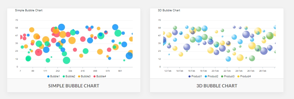
A bubble chart is a type of chart that displays data values as points in bubbles. Data are typically plotted on two axes, where one represents the domain or category and the other is used to represent value (e.g., cost).
The same as Scatterplot, this type of char makes use of the Cartesian coordinate method to design points along a grid where the Y and X-axis are split variables. On the other hand, not like a Scatterplot, every point is allocated a category or label. Every designed point signifies a third variable in the area of its bubble. Colors are used to determine between groups or utilized to represent an extra data variable.
This type of char is usually utilized to measure or evaluate and display the connection between categorized circles, by the application of proportions and positioning. The whole picture of this chart can be utilized to examine and evaluate correlations and patterns.
Bubble charts provide visual context for understanding what numbers mean by showing graphically what percentage of total dollars were spent across different categories such as salaries versus marketing expenses for example. This technique also allows viewers to visualize comparisons between both quantitative and qualitative information simultaneously.
A lot of bubbles make the chart complex and difficult to read. Therefore, it must have a limited size data capacity. On the other hand, this problem can be addressed by interactivity, hovering, or by means of clicking over circles to show the information that has been covered or hidden, having a choice to filter or sort out-group categories.
The same as other types of charts, including Proportional Area Charts, circle, or bubble sizes, have to be drawn based on the bubble’s area, and not should be based on its diameter as well as radius. Not just will the dimension of the bubbles alter exponentially, but this will result in a misunderstanding by your visual system.