When designing a Flutter app, the layout of the site is crucial. Creating an attractive and user-friendly design can help to boost user interaction. But how do you know what layout will work best for you? There are many options available such as: liquid grids, fixed grids, or responsive layouts. Grid layouts have become popular in recent years due to their versatility in accommodating different screen sizes, column proportions and more.
If you’re looking for a layout that is simple, straightforward and flexible then the flutter_layout_grid package may be your best bet. flutter_layout_grid is a grid layout system for Flutter, which allows you to create an unlimited number of columns without having to worry about margins or padding.
Features
- Fixed, flexible, and content-sized rows and columns
- Precise control over placement of items, including the ability to span rows, columns, and overlap items
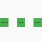
- Named grid areas for descriptive positioning of children
- A configurable automatic grid item placement algorithm, capable of sparse and dense packing across rows and columns
- Right-to-left support, driven by ambient Directionality or configuration
- Accessibility considerations
- Extension methods and helper functions for descriptive, and short, layout code
- Debugging aids, including widget property listings in DevTools, Debug Painting, and visual indication of child overflow
Install the package
flutter_layout_grid: ^1.0.1Example
import 'dart:ui';
import 'package:flutter/material.dart';
import 'package:flutter_layout_grid/flutter_layout_grid.dart';
class Homepage extends StatefulWidget {
const Homepage({Key? key}) : super(key: key);
@override
_HomepageState createState() => _HomepageState();
}
class _HomepageState extends State<Homepage> {
Widget _section(Color color, Widget child) {
return Container(
width: double.infinity,
height: double.infinity,
color: color,
child: Center(child: child),
);
}
@override
Widget build(BuildContext context) {
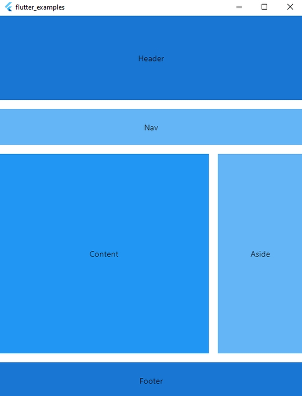
return Scaffold(
body: Container(
child: LayoutGrid(
areas: '''
header header header
nav nav nav
content content aside
content content aside
footer footer footer
''',
columnSizes: [152.px, 1.fr, 152.px],
rowSizes: [
150.px,
64.px,
auto,
1.fr,
64.px,
],
columnGap: 16,
rowGap: 16,
children: [
_section(Colors.blue.shade700, Text('Header')).inGridArea('header'),
_section(Colors.blue.shade300, Text('Nav')).inGridArea('nav'),
_section(Colors.blue, Text('Content')).inGridArea('content'),
_section(Colors.blue.shade300, Text('Aside')).inGridArea('aside'),
_section(Colors.blue.shade700, Text('Footer')).inGridArea('footer'),
],
),
),
);
}
}
