TextView and Button are the most commonly used View. We can add some effects to these 2 views to make them more useful in different cases.
Table of Contents
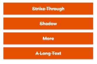
Strike Through
This effect is added in code.
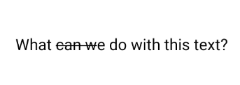
//use Paint
TextView textView = (TextView) findViewById(R.id.textView);
textView.setPaintFlags(textView.getPaintFlags() | Paint.STRIKE_THRU_TEXT_FLAG);
Button button = (Button) findViewById(R.id.button);
button.setPaintFlags(button.getPaintFlags() | Paint.STRIKE_THRU_TEXT_FLAG);

//use StrikerhroughSpan
StrikethroughSpan strikethroughSpan = new StrikethroughSpan();
String message = "What can we do with this text?";
textViewQuestion.setText(message, TextView.BufferType.SPANNABLE);
Spannable spannable = (Spannable) textViewQuestion.getText();
spannable.setSpan(strikethroughSpan, 5, 10, Spanned.SPAN_EXCLUSIVE_EXCLUSIVE);
Using Paint will affect the view’s whole text. Following are 3 buttons with the same strikethrough effect:
By using StrikethroughSpan, you can set what part of the text to be affected. For example, I only add this effect from the 5th to 10th character.
Shadow/Outline
Shadow and outline are the same effect. The difference is shadow’s radius.
In layout:
<TextView
android:id="@+id/textview"
android:layout_width="wrap_content"
android:layout_height="wrap_content"
android:layout_gravity="center_horizontal"
android:shadowColor="@color/color_black"
android:shadowDx="0"
android:shadowDy="0"
android:shadowRadius="50"
android:text="Shadow Text"
android:textColor="#FFFFFF" />
In style:
<style name="text_shadow">
<item name="android:shadowColor">#000000</item><br />
<item name="android:shadowDx">1</item><br />
<item name="android:shadowDy">1</item><br />
<item name="android:shadowRadius">3</item><br />
</style>
- android:shadowColor – shadow color
- android:shadowDx – shadow’s X-axis offset
- android:shadowDy – shadow’Y-axis offset
- android:shadowRadius – how wide the shadow should be blurred at the edges
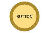
Round Button
In layout:
<Button
android:id ="@+id/buttonRound"
android:layout_width="100dp"
android:layout_height="100dp"
android:text="Button"
android:background="@drawable/button_round"
android:padding="10dp"
/>
Create a new Drawable resource file named button_round under drawable folder.
<?xml version="1.0" encoding="utf-8"?>
<selector xmlns:android="http://schemas.android.com/apk/res/android">
<item>
<shape android:shape="oval">
<solid android:color="#fede84"/>
<stroke android:color="#aa892b" android:width="10dp" />
<size android:width="100dp" android:height="100dp"/>
</shape>
</item>
</selector>